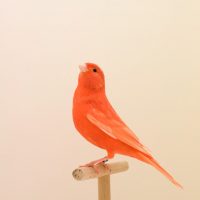
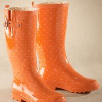
🍊🍊🍊🍊🍊🍊🍊🍊🍊
It’s rich and lush and juicy. It’s a color that gets less design love than the likes of blue and green, but it offers a punch that’s unique and powerful.
Today we take a visual moment to drink in the lusciousness of the color orange. If your brand includes orange, are you using to its maximum effect? If your brand needs a pop of interest, would orange work for you?
Even if it isn’t a good fit for your brand, these images show the power of color and what it can do for your business. The right images allow you to harness that power and tap into your users’ emotions. The competition for online eyeballs and attention is stiff. Using images and color to your advantage can help separate your business from the visual clutter that populates our online feeds. Offering something beautiful, instead of something so-so sets you apart and elevates your brand and its visibility online.
To help you understand the power of color and photography in your small business online marketing, we will be doing a series of color features. Let’s get more creative and more persuasive together to help spread the word about your small business!


