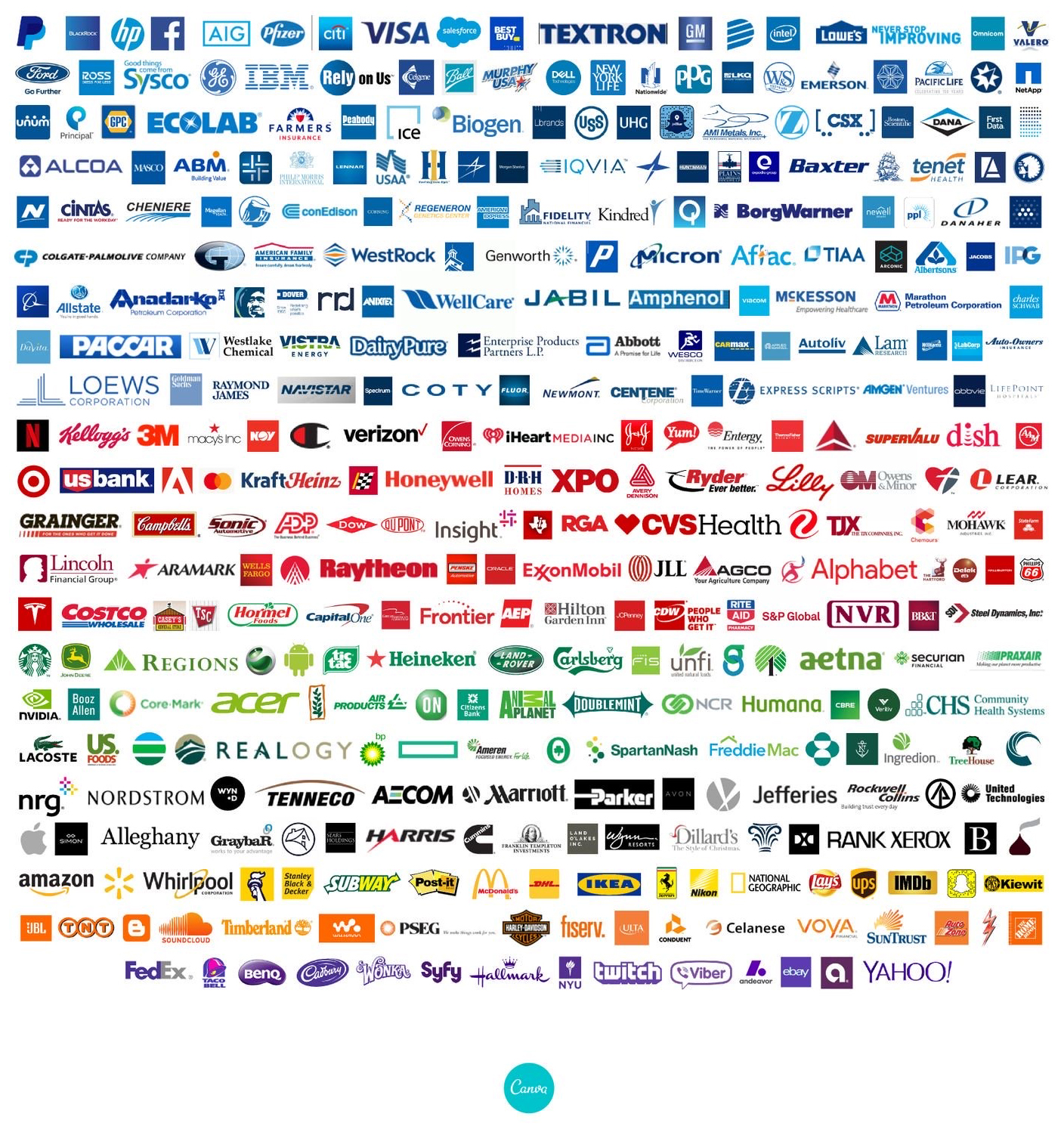
On we go in our exploration of color and how it can inspire and influence your marketing and branding. We focus today on blue. Blue is beautiful, bold, and blissful. It conveys a sense of loyalty, calm and dependability. For this reason, blue is the most popular color in corporate branding among the Fortune 500. The image below (thanks, Canva!) shows the dramatic usage of blue among these top companies.

A quick scan of our client list reveals that a full 40% of the businesses we work with (more representative of usage among small businesses) use some type of blue in their logo or corporate color scheme. Even our own branding includes blue, although our chosen blue hue leans more turquoise than the blues shown here.
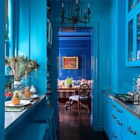
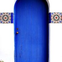
Blue is getting extra love in 2020 after being chosen by the color gurus as the official color of the year. The chosen color, more specifically, is Pantone’s Classic Blue. Aptly named, it is the blue you think of as crayon blue, royal blue, good ole blue-blue. Our color gallery focuses on these shades, but there are gorgeous blues all along the azure spectrum from powder barely-blues to rich navys.
When you scroll through these images, how do they make you feel? When done well, your brand and the images you use to support it, will tap into a feeling in your potential customers that will draw them to your brand. What feeling do you want to evoke? How is that in-line, or not, with your current brand?


