Let’s talk today about color and its role in your overall branding. It may seem like an obvious thing, but in the context of website design, it deserves a little more thought to ensure that you present a cohesive brand both on and offline. Because websites include photography, video, and text content, there are many opportunities to include color beyond simply your logo.
Your brand’s color starts, obviously, with the color(s) in your logo. For us, that’s charcoal and green.

However, if you limit your brand to just the one or two colors you use in your logo, you could end up with a drab website design. And I’m guessing drab isn’t where you are headed image-wise. Imagine if our website was just dark gray and green. It would present a very different feel than it does. To get the most out of the medium, you need to think about a more comprehensive color strategy for your brand and then employ that full spectrum of brand colors to create a vibrant and visually interesting website.
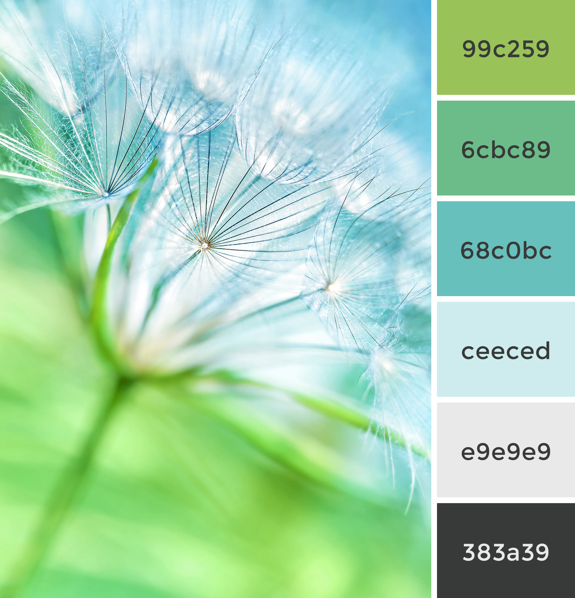
In the image below, you see our brand’s color scheme. The green and charcoal from our logo are there at the top and the bottom, but notice the complementary colors in between and how they change the entire tone of the brand. We use photography, typography, and color blocking throughout the website design to pull in these additional brand colors and create a fresh feel that echoes our approach to doing business.

Once you have a more defined color palette, you can make sure your team uses it consistently across all your marketing, including print ads, brochures, social posts, signage, etc.
If you need help with color strategy, we are here!

