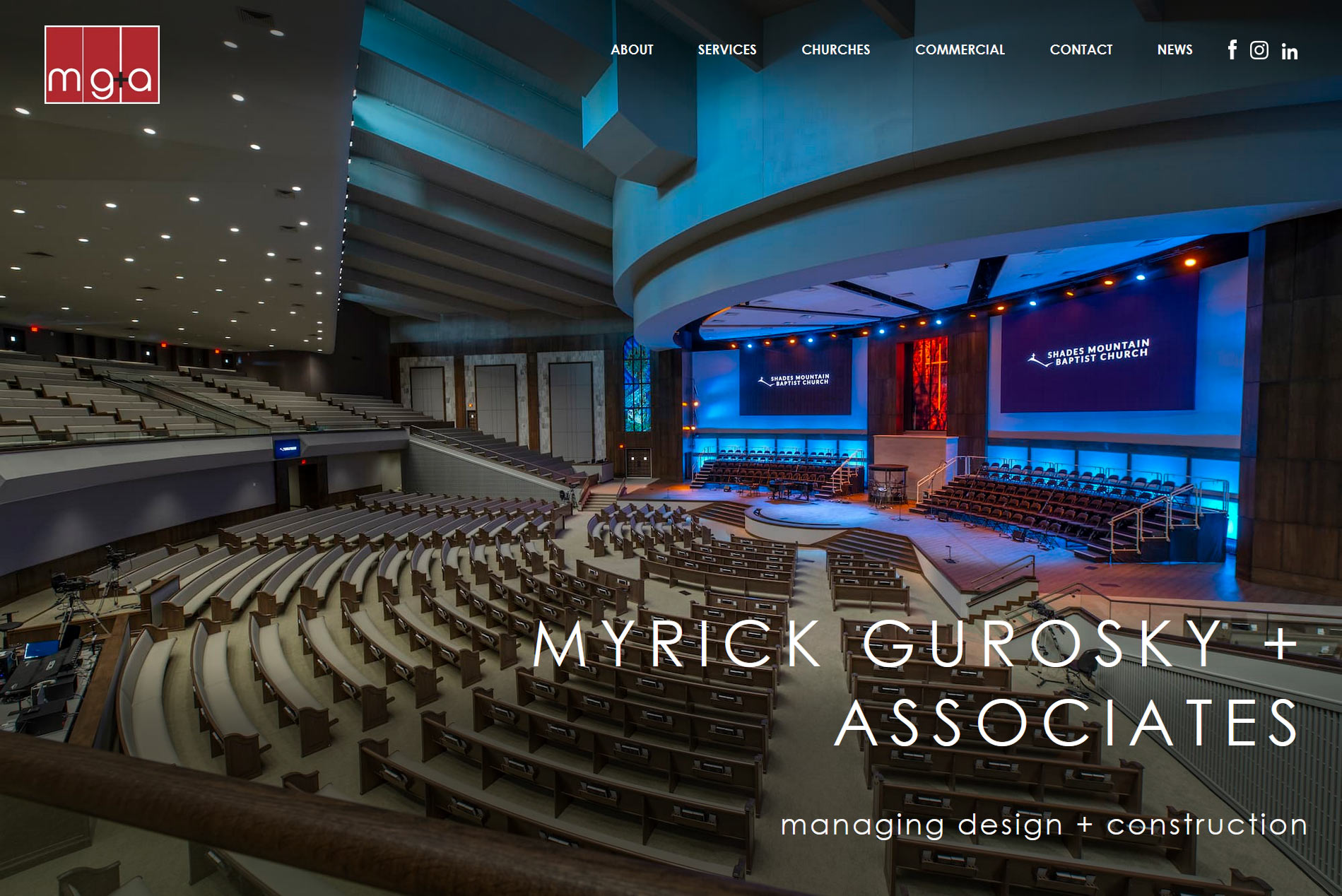
We were thrilled when our client, Myrick Gurosky + Associates, decided it was a time for a website redesign. We designed their previous site in 2014, so it was coming up on its 5th birthday. In the intervening five years, design standards, screen resolutions, and user technologies and behaviors had advanced. It was time to update the look and functionality of their website to take full advantage of today’s technologies.
The nature of MG+A’s work is visual—they design and build gorgeous spaces, including churches, healthcare, institutional, office and retail projects. With new design standards and wider, higher impact use of photography, we improved the size, presentation, and functionality of the images within their online portfolio of projects. The new, custom WordPress website design and build maximizes the usage of screen real estate and allows the site’s photography to illustrate the impressive work they do.

MG+A had this to say about the redesign process and the new website:
From day one, Alli and her team worked hard to ensure our expectations were met or exceeded. The confidence and experience her team brought to the table was refreshing in today’s business world where everyone seems too busy to meet deadlines. Alli and her team kept us on schedule throughout the entire process, which enabled us to unveil our new site in the exact time frame we had initially agreed upon. We are very pleased with the service and the product provided by Dandelion Marketing and can recommend with confidence. – Kaleb Reid, Myrick Gurosky & Associates
One of our favorite things about doing what we do is growing alongside our clients over time. Thank you, MG+A, for the opportunity to work with you on your new website!

