Part 1: Psychology and Theory of Color
Colors are powerful—really powerful. Colors provide micro-signals to our brains that quietly influence the way we feel and behave. When I first learned this, I found that it made me a bit uneasy, provoking thoughts of dystopian color-based mind control. But actually, color psychology, when used for good, can make the world a better place. For instance, some countries have had success reducing suicide rates at railroad stations by installing blue streetlights (blue is known to create a calming affect).
Considering the influence color can have on human behavior, it’s no wonder that the use of color is an essential component of your small business marketing. Employing color to market your business requires choosing strong (and appropriate) brand colors. Your company colors have a powerful effect on the first impression you make. Those colors communicate a message to your audience. What is the message of your brand colors?
In this first post in our two-part brand colors series, we will guide you through the psychology and theory of color. In part two, we’ll apply the science of color to your specific brand. Our goal is help you establish and use a compelling color palette for your business that supports and furthers your company’s message. In doing so, you can speak more effectively to your target audience and encourage new (and more) sales for your small business.
Color Psychology
Colors evoke emotions. This may seem like stating the obvious, but stay with me. We all know red represents passion or anger and that pink represents femininity. But how much have you thought about the use of color in your business and how you can use it to your advantage? According to Wikipedia,
“customers generally make an initial judgment on a product within 90 seconds of interaction with that product and about 62%-90% of that judgment is based on color.”
Whoa. Those are numbers that make color count.
Understanding the psychology of color is wildly important when it comes to branding your business. Not only do your brand colors make your business more recognizable, they also communicate a silent message about your brand—it’s vital to make sure it’s the right message. Before choosing a color palette for your brand, you’ll want to learn a bit about common colors and the feelings they evoke.
How Do Colors Feel?
Red is an extremely intense color. It brings feelings of hate, anger, and war, but also passion, love, and desire. Because of its intensity, it is often used to grab the attention of the viewer, such as in stop signs and clearance tags.
Orange solicits feelings of energy and liveliness. It can also indicate affordability, making it popular with discount brands.
Yellow is incredibly bright and attention grabbing, making it popular for expressing the need for caution (think safety vests and wet floor signs). It also represents happiness (we all remember smiley, right?). However, according to Forbes, you should be careful using yellow, as most adults do not tend to prefer it. Children, however, are typically very attracted to yellow.
Green has a strong connection to nature, therefore it often symbolizes health, wellness, and serenity. In cultures where money is green, it can express wealth and prosperity. And of course, it has strong ties to sustainability and environmental protection.
Blue provokes feelings of calmness and serenity (which is evident to anyone who has ever been to a beach), as well as reliability, security, and trust, making it extremely popular with banks. However, it can also depict sadness and grief (i.e. “feeling blue”).
Purple is the color of royalty so it is often used to market luxury products. It is also linked to fantasy and mystery, making it a popular color with more eclectic brands.
Pink obviously portrays femininity and romance and is typically used to market to women and girls. Light pink brings feelings of softness, while a brighter pink can represent passion, as it is closer to red.
White often embodies cleanliness and sterility (think hospitals), but can also represent sophistication, elegance, or purity.
Black can be sleek and luxurious or edgy and cool, depending on the context. It is also very professional, which is why many retail stores require their employees to wear all black.
Brown gives off a rugged, woodsy vibe, making it popular with products that appeal specifically to men.
Tints, Shades, and Tones
Additionally, it is important to consider tints, shades, and tones when creating your brand colors.
Tints are colors mixed with white, giving them a brighter appearance.

You create shades of a color by mixing in a little black, giving it a deeper appearance.

Tones are created by adding different amounts of grey to pure colors, making them less vibrant.

See how these changes dramatically affect a color’s mood?
This is, by no means, an exhaustive study on color psychology, but it gives you an idea on the general impact that specific colors have. Take these color associations into consideration when crafting your color palette.
Color Theory
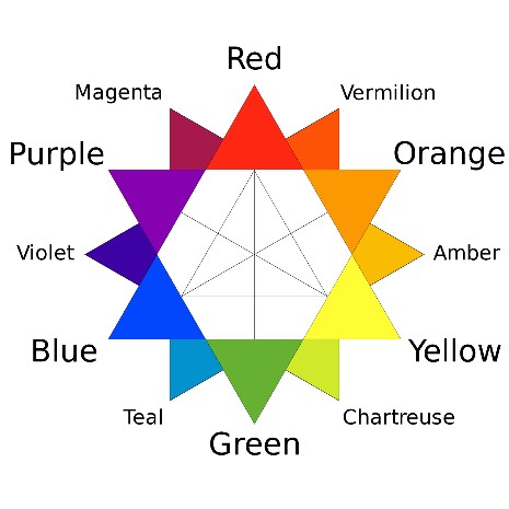
Before choosing your brand colors, it helps to learn a little about color theory to make sure you are choosing colors that look nice together. There are four main types of color palettes that are scientifically proven to look harmonious based on the color wheel:
Analogous – An analogous color palette will contain colors that are next to each other on the color wheel, such as red and orange.
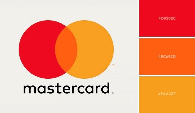
Complementary – Complementary colors are colors that are opposite each other on the color wheel, such as blue and orange.
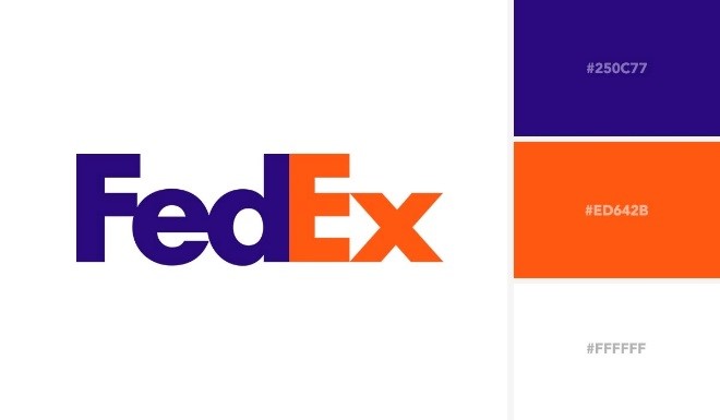
Triadic – A triad is three colors that form a triangle on the color wheel, such as red, blue, and yellow.

Monochromatic – A monochromatic color palette will contain colors that are all different shade, tints, or tones of a single hue.
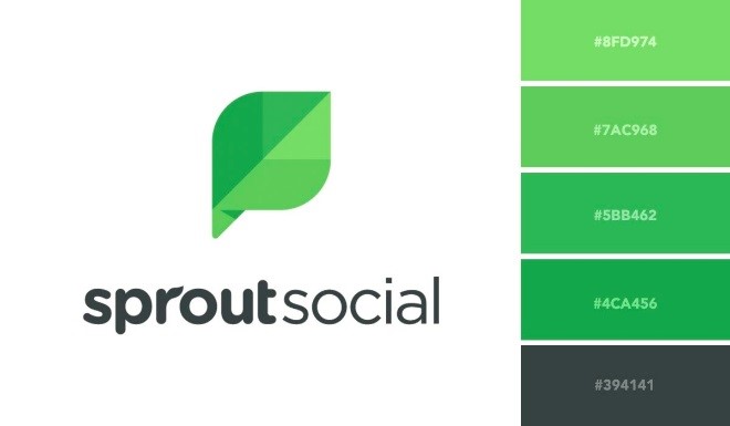
What colors do you use now for your brand? Which of the four palettes do you use? Do these choices make sense for your target audience and ideal customer? Stay tuned for Part 2 as we apply these theories to real life small business brands.

