In Part 1 of this Brand Colors series, we covered color theory and psychology. Now that we know the power of colors and how they can be used to create certain feelings, it is time to apply that knowledge to your business and your brand. Use the following steps and tips in choosing brand colors for your business.
Step One: Define Your Brand
Before choosing the perfect set of colors to inspire your audience, you will need to do a little thinking about the customers you want to appeal to and the emotions you want your brand to evoke. Take into consideration the personality of your business, as well. Is your brand energetic, fun, sophisticated, subdued, masculine, feminine? Do research on other successful companies in your industry to gain inspiration, but be careful not to copy other brands. You want your palette to be recognizable as your business—not someone else’s.
Step Two: Choose Your Main Colors
Based on the guidelines above, choose what type of color palette you want to go with (analogous, complementary, triadic, or monochromatic). As a starting point, choose one to three main colors that will go well together and represent your brand perfectly. If you are a competitive real estate company, you may want something that grabs your attention, like red or yellow. But an organic day spa or dermatology practice might choose more calming colors, such as soft blues and greens. Your main colors will be used most often in your branding and should be the most dominant colors in your palette.
Step Three: Choose Your Accents
Next, you will need some accent colors. Accent colors are usually lighter or more toned-down colors and are necessary to ensure contrast. This is where tints really come in handy, as you can add white to your main colors to create accents. It helps to have one neutral color, such as grey, beige, or white, in the mix as well to be used as a background.
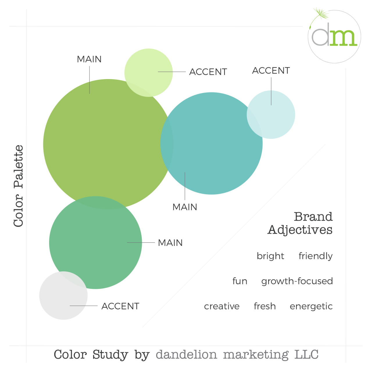
To move from the abstract to the more useful concrete, let’s look at an example. This is the dandelion marketing color palette.

If we think back to the psychology and theory of color that we discussed in Part 1 of this series, we can glean the following from the colors of our brand.
- Blues and greens communicate growth, prosperity, and freshness.
- We use a complementary palette, meaning we use colors that are next to each other on the color wheel. For us, that means that we offer a range of inter-related and complementary services that work together in unison to create the growth and prosperity we build for our clients.
- We use modern versions of these colors (lime instead of forest green – turquoise instead of navy blue) to connote the up-to-date / digital technology that we use as our tools in helping our clients. They are the more fun, creative and energetic versions of these colors, instead of the more traditional hues.
Helpful Color Tips
- Colors often have different connotations in various parts of the world. For example, apparently green is considered a “forbidden color” in Indonesia. This is probably not an issue for most small businesses who serve customers locally, but if you are catering to an international audience, consider cultural context when thinking of colors.
- Your color palette can include anywhere from one color to as many as ten or more, but we recommend keeping it between four and seven. Any less can be limiting and more can add confusion.
- If you need some color inspiration, create a Pinterest board and fill it with photos that represent the mood you want for your brand. Then pick colors from that collection of images to get you started. See the images below to see how that works for us.


Your brand colors will be used in just about every aspect of your business, from your website to your business cards to your social media, so choose carefully. But don’t be afraid to color outside the lines! There are no hard and fast rules when it comes to choosing your brand colors; trust your instincts and your sense of creativity.
And don’t forget: if you’re feeling overwhelmed by the whole thing, you can hire a professional! That’s why we’re here.

